Histograms are probably one the most intuitive ways of performing density estimation in numerical data. In this writeup, I discuss some of their deeper meanings and properties, as I try to digest Wayne Oldford’s excellent lecture on the subject.
In particular, we look at how well one can expect to approximate an underlying density as one has access to more samples and utilizes narrower bins. We then discuss a form of histogram that is much less sensitive to the location of bin boundaries, called an Average Shifted Histogram [1]. This kind of histogram has deeper connections to kernel density estimation, and we will therefore touch briefly on that too.
I believe this kind of reflection to be a useful exercise to any practitioner without a background in statistics (e.g., me) who has found herself tweaking histogram parameters, wondering about their limitations, and wondering as to whether better methods existed.
Histograms
When data is one-dimensional and real-valued, histograms are typically constructed by partitioning the region where the observed data lies into a set of \(m \geq 1\) bins. Each bin \(A_k\) (\(1 \leq k \leq m\)) is then represented as an interval:
\[ A_k = \left[t_k, t_{k+1}\right) \]
where the bin width is given by:
\[ h = t_{k+1} - t_k \]
To simplify things, and because this is the most common case, we assume that all bins are of the same width. Other arrangements, however, are clearly possible (e.g., exponentially-sized bins).
Bin \(A_k\) is also assigned a height, which is proportional to the number of points \(n_k\) that fall into it. In other words, if we have a set of observed data points \(\mathcal{D} = \{x_1, \cdots x_n\}\) ordered by value (i.e. \(x_i \leq x_j\) iff \(i \leq j\)), we define \(n_k\) as:
\[ n_k = \left|\mathcal{D} \cap A_k\right| \]
and assign a height to \(A_k\) which is proportional to \(n_k\). In particular, we could assign a height to \(A_k\) which is equal to \(n_k\) (as \(n_k\) is surely proportional to itself), in which case we would have a frequency histogram.
Let us now look at an example, based on the Old Faithful’s eruption dataset. The first \(5\) rows in the table are shown in Table 1.
data(geyser, package = 'MASS')| waiting | duration |
|---|---|
| 80 | 4.016667 |
| 71 | 2.150000 |
| 57 | 4.000000 |
| 80 | 4.000000 |
| 75 | 4.000000 |
The dataset contains two columns: duration and waiting, which describe the duration of an eruption and the time ellapsed until that eruption, respectively.
We plot the points corresponding to the duration of each eruption in a line in Fig. 1. This gives us a rough idea of their distribution.
ggplot(geyser) +
  geom_segment(aes(x = duration, xend = duration, y = -.1, yend = .1)) +
  ylim(-1, 1) +
  theme(
    axis.title.y = element_blank(),
    axis.text.y = element_blank(),
    axis.ticks.y = element_blank()
  ) +
  xlab('duration (minutes)')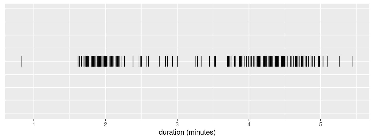
Figure 1: Duration of Old Faithful’s eruptions.
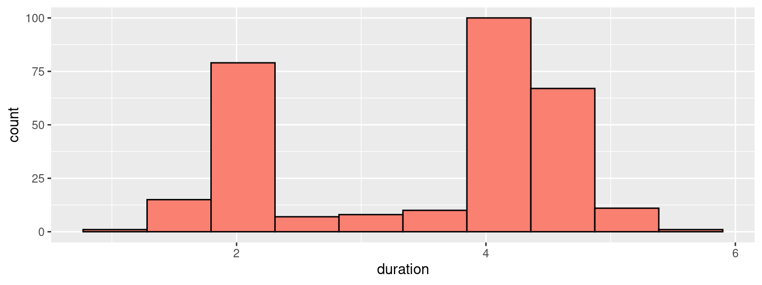
We can then use those to construct a frequency histogram, with \(10\) equally-sized bins:
ggplot(geyser) +
  geom_histogram(
    aes(x = duration),
    fill = 'salmon',
    bins = 10,
    col = 'black'
  )
When used for density estimation, however, histograms are typically rescaled so that the sum of the areas of the bars equals to one. This is accomplished by dividing each \(n_k\) by the number of points \(n\), times the bin width \(h\), and assigning the resulting value to the bin’s height. We call this resulting value \(\hat{p}_k\):
\[ \hat{p}_k = \frac{n_k}{nh} \]
ggplot(geyser) +
  geom_histogram(
    aes(x = duration, y = ..density..),
    fill = 'salmon',
    bins = 10,
    col = 'black'
  )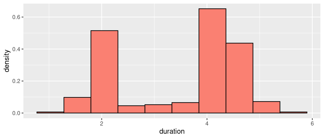
Figure 2: Durations of Old Faithful’s eruptions (density histogram).
Now let \(f(x)\) be the unknown density function we are trying to estimate. A histogram essentially defines an approximate density function based on the sample \(\mathcal{D}\), which we name \(\hat{f}(x)\) and which, for every \(x \in A_k\), states that the density of \(x\) is \(\hat{f}(x) = \hat{p}_k\). How far, then, is this approximation from the real density, \(f(x)\)?
Histogram Bias
To understand the quality of the approximation that the histogram provides, we look at its bias:
\[ \text{Bias}\left[\hat{f}(x)\right] = \mathbb{E}\left[\hat{f}(x)\right] - f(x) \]
Where the expectation on the right-hand side is taken with respect to all samples \(\mathcal{D}\) of size \(n\). To understand how to compute the expectation let us assume, without loss of generality, that \(x\) belongs to some interval \(A_k\). For a given sample \(\mathcal{D}\) drawn from \(f\), let \(N_k\) be the random variable which represents the number of points that ended up in bin \(A_k\). We have that:
\[ \mathbb{E}\left[\hat{f}(x)\right] = \mathbb{E}\left[\frac{N_k}{nh}\right] = \frac{1}{nh}\mathbb{E}\left[N_k\right] \]
Suppose we knew that the probability that a single sample ends up in bin \(A_k\) is \(p_k\) (which is different from its estimator, \(\hat{p}_k\)). The probability that we get \(N_k = m\) samples out of \(n\) (the size of \(\mathcal{D}\)) in \(A_k\) is then just the probability that we get \(m\) heads out of \(n\) coin flips for a coin where the probability of getting heads is \(p_k\). This means that \(N_k\) follows a binomial distribution; i.e., \(N_k \sim \text{Binomial}(n, p_k)\). \(\mathbb{E}\left[N_k\right]\) therefore is equal to \(np_k\), so that:
\[ \frac{1}{nh}\mathbb{E}\left[N_k\right] = \frac{np_k}{nh} = \frac{p_k}{h} \]
Now note that \(p_k\) is the probability that one sample falls in bin \(A_k\); i.e., that it falls between \(t_k\) and \(t_{k+1}\).
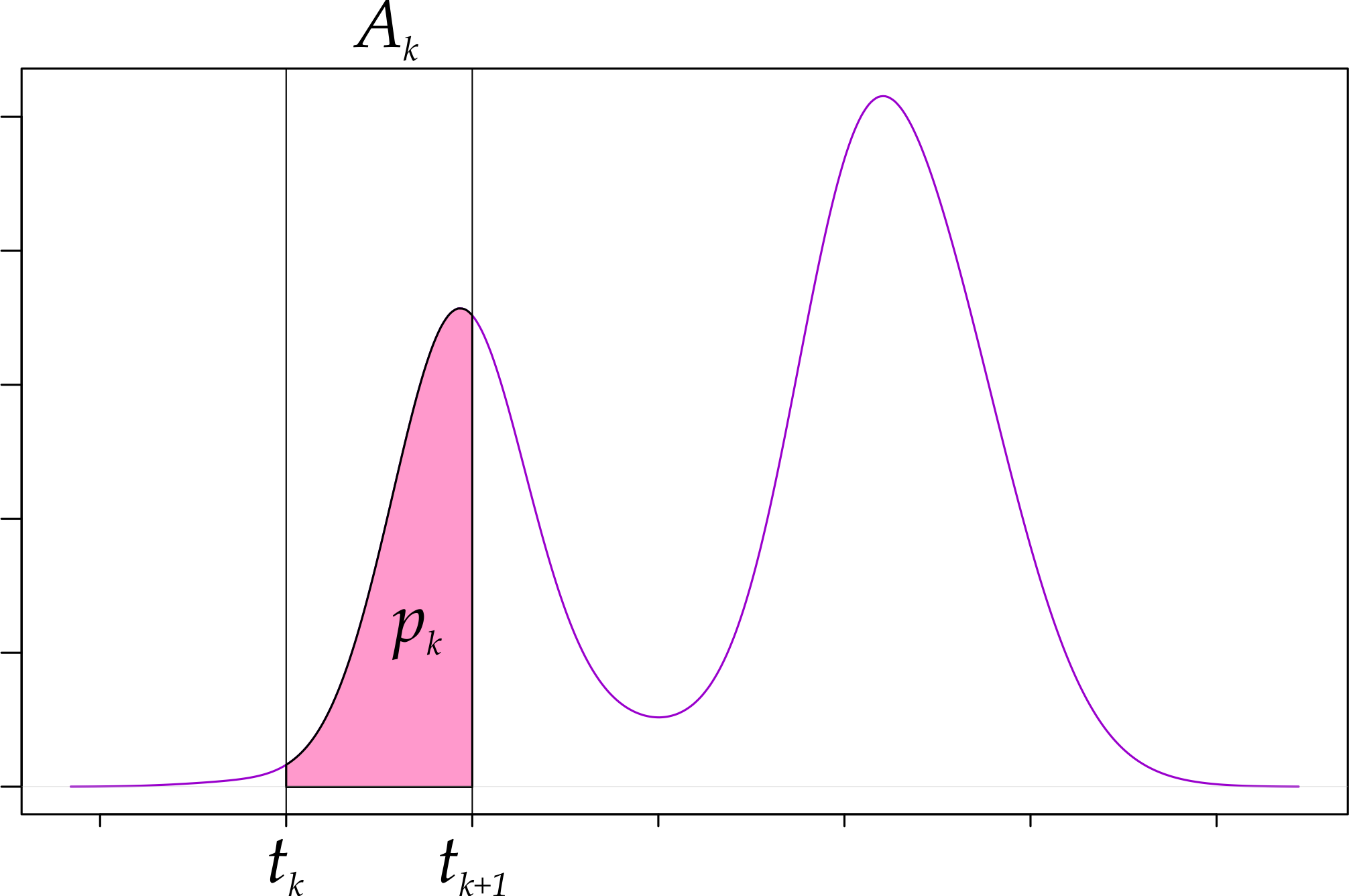
Figure 3: Histogram bins and the underlying density.
Fig. 3 tells us, however, that \(p_k\) can be expressed in terms of \(f\) as:
\[ \begin{equation} p_k = \mathbb{P}[t_k \leq X \leq t_{k + 1}] = \int_{t_k}^{t_{k+1}} f(x)\,dx = F(t_{k+1}) - F(t_{k}) \tag{1} \end{equation} \]
Where \(F\) is the corresponding cumulative density function for \(f\). The final equation for the bias is, then:
\[ \begin{equation} \text{Bias}\left[\hat{f}(x)\right] = \frac{p_k}{h} - f(x) \tag{2} \end{equation} \]
What Eq. (2) tells us is that the bias for the histogram depends on \(h\) but not on \(n\), which is reasonable. In particular, the bias will be small at \(x\) as \(p_k\) approaches \(hf(x)\). Further, Eq. (1) tells us that the bias will be small for any \(x\) as \(h\) tends to zero, given that:
\[ \begin{equation} \lim_{h \to 0} \frac{p_k}{h} = \lim_{h \to 0} \frac{F(t_{k+1}) - F(t_{k+1} - h)}{h} = f(t_{k+1}) \stackrel{*}{=} f(x) \tag{3} \end{equation} \]
where the last equality results from the fact that \(x\) is by construction contained in \(A_k\) and, therefore, as \(h\) approaches zero we get that \(t_{k} = t_{k+1} = x\).
Great! So we just have to make our \(h\) very small and we will get a great histogram, right? Well, not so fast…
Histogram Variance
As is often the case, a lower bias does not come for free. Indeed, if we look at the variance for \(N_k\), we get:
\[ \begin{equation} \text{Var}\left[\hat{f}(x)\right] = \text{Var}\left[\frac{N_k}{nh}\right] = \frac{p_k(1 - p_k)}{nh^2} \tag{4} \end{equation} \]
which does not look like good news: to prevent variance from blowing up, it would appear that we have to increase \(n\) faster than we decrease \(h\), and that the required increase in \(n\) becomes more dramatic as \(h\) approaches zero.
I say that it would appear to be that way because what happens to variance as we keep \(n\) fixed and let \(h\) go to zero is not immediately obvious: as we narrow down our bin width \(h\), \(p_k\), the probability that a point falls in our bin, also decreases towards zero. If \(p_k\) manages to compensate the decrease in \(h\) somehow, perhaps variance does not blow up after all.
We can solve this mistery by rewriting Eq. (4) and looking at its limit as we let \(h \to 0\):
\[ \lim_{h \to 0}\frac{1}{nh}\left(\frac{p_k}{h} - \frac{p_k^2}{h}\right) \]
We know from Eq. (3) that \(\lim_{h \to 0}\frac{p_k}{h} = f(x)\), which is a finite non-negative real number. Since \(p_k < 1\), we also know that \(0 \leq p^{2}_k \leq p_k\), meaning that \(\lim_{h\to0}\left(p_k/h - p_k^2/h\right)\) must converge to a non-negative real number as well (limits are linear). This leaves us with \(\lim_{h \to 0}\frac{1}{nh}\), which, barring an equivalent increase in \(n\), will blow up to \(+\infty\). As \(h\) tends to zero, therefore, \(\text{Var}\left[\hat{f}(x)\right]\) tends to infinity.
We are, therefore, stuck with this fact of life: when using histograms we can either choose to have wide but imprecise (biased) bins, or narrow but unreliable ones.
More on Bias
Another interesting point to consider is the relationship between bin width, bias and the shape of \(f\). Clearly, an \(f\) which contains narrow peaks will be much harder to approximate with a wide rectangle than an \(f\) which is completely flat (think uniform distribution). This intuition can be made formal if we look at the bias equation (Eq. (2)) again, but transform it slightly. Specifically, we will rewrite the term \(p_k/h\) in another way.
Recall that Eq. (1) tells us that:
\[ p_k = \int_{t_k}^{t_{k+1}} f(x)\,dx \]
The mean value theorem for definite integrals, then, tells us that if we were to draw a rectangle with base in \(A_k = [t_{k}, t_{k+1})\) and make it tall enough so that its area is equal to \(p_k\), then its height must be equal to \(f(\xi)\) for some \(\xi \in A_k\).
The intuition for this is depicted in Fig. 4: if we draw a rectangle with base in \(A_k = [t_k, t_{k+1})\) and area \(a_k\), we have three options. Either the top side of the rectangle:
- is completely under \(f(x)\), in which case \(a_k < p_k\);
- is completely above \(f(x)\), in which case \(a_k > p_k\);
- is neither above nor below \(f(x)\), in which case we can pick \(t_k \leq \xi < t_{k+1}\), such that \(a_k = p_k\).
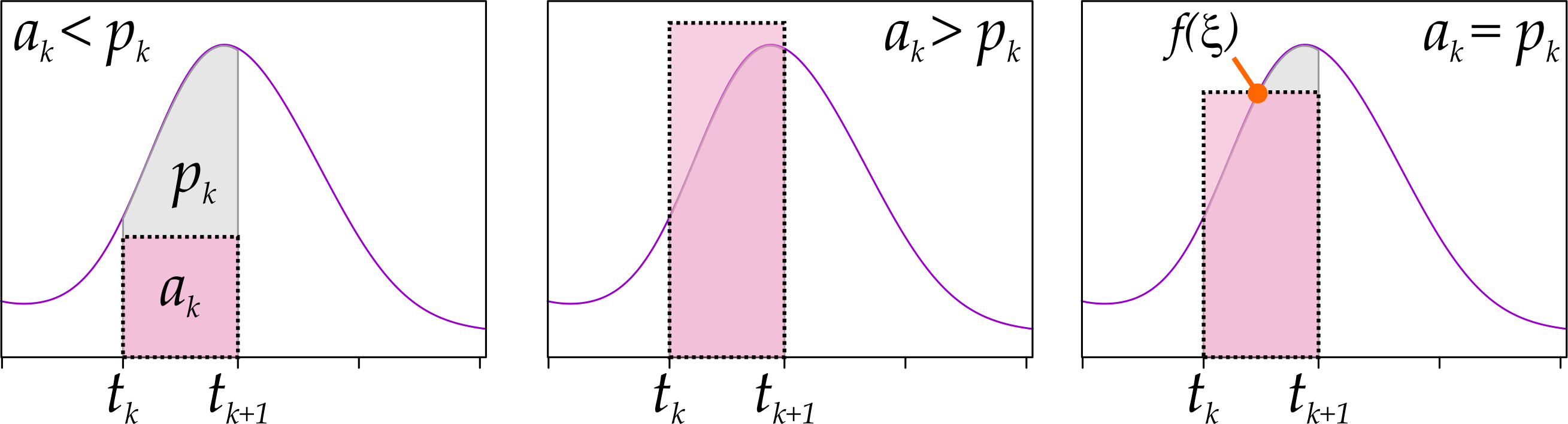
Figure 4: Mean value theorem for definite integrals.
Recalling that \(t_{k+1} - t_{k} = h\), we can therefore say that:
\[ p_k = \int_{t_k}^{t_{k+1}} f(x)\,dx = hf(\xi) \]
for some \(t_k \leq \xi < t_{k+1}\). We can therefore rewrite the bias from Eq. (2) as:
\[ \text{Bias}\left[\hat{f}(x)\right] = \frac{p_k}{h} - f(x) = f(\xi) - f(x) \]
If we now make the rather mild assumption that \(f\) is Lipschitz continuous on \(A_k\); i.e., that there exists some \(\gamma_k \in \mathbb{R}\) such that, for every \(x, y \in\mathbb{R}\) we have:
\[ \left|f(y) - f(x)\right| < \gamma_k\left|y - x\right| \]
We get that the absolute value for the bias is also bounded:
\[ \begin{equation} \left|\text{Bias}\left[\hat{f}(x)\right]\right| = \left| f(\xi) - f(x) \right| \leq \gamma_k|\xi - x| \leq \gamma_kh \tag{5} \end{equation} \]
where the last inequality holds because both \(x\) and \(\xi\) are in \(A_k\) and, therefore, cannot be farther apart by more than \(h\), the width of the bin \(A_k\).
One way of looking at what Eq. (5) is saying is that the closer the slope of \(f\) over \(A_k\) is to zero, the wider the rectangles we can use to approximate \(f\) acceptably. Although this is only an upper bound, the result is intuitive: a flatter function is easier to represent with a rectangle than a function that varies steeply, up or down1.
Location Variance and Average Shifted Histograms
So far we have touched upon fundamental theoretical properties of histograms which we cannot do much about. We will now discuss something that wfe can actually improve: histogram variance due to bin alignment.
The main issue relates to the fact that we can generate differently shaped histograms by simply varying the location of the first bin or, equivalently by shifting the data itself2. The effect is shown in Fig. 5, where we plot three histograms in which we shift the bins, initially aligned at \(0\), by two different values. Some features of the dataset, notably the peak near \(4\), get more pronounced in the rightmost histogram.
breaks <- function(X, bins, offset) {
  width <- diff(range(X)) / bins
  offset + seq(min(X) - width, max(X), by = width)
}
par(mfrow = c(1, 3))
for (offset in c(0, 0.2, 0.34)) {
hist(
geyser$duration,
breaks = breaks(geyser$duration, 10, offset),
main = sprintf('11 bins, bin shift %f', offset),
right = FALSE,
ylim = c(0, 1),
xlab = 'duration',
freq = FALSE
)
}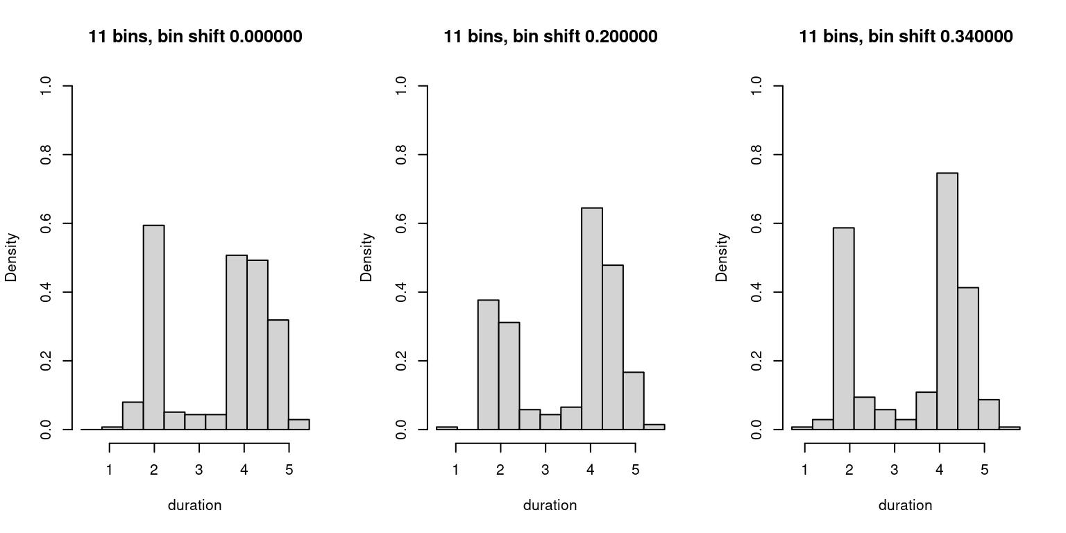
Figure 5: Variation in shifted histograms.
This variability gets in the way of us understanding the actual nature of the underlying density. Clearly, we could mitigate the issue by using very narrow bins, but that would increase our data-related variance (Eq. (4)) thus producing a noisy and equally unreliablehistogram. What can, then, we do about it?
Histogram Overplots
One simple way of improving the situation is by plotting superimposed, transparent versions of our shifted histograms on top of each other. We call these shifted histogram overplots, or SHOs. The idea with SHOs is that we can amortize the effects of variations due to shifting by preemptively shifting them ourselves and “visually averaging” the effects of this shifting.
A SHO is specified by adding an extra parameter, \(m\), which controls the number of shifted copies we plot. For a given bin width \(h\), we plot \(m\) histograms, shifting bin alignment for the \(j^{th}\) histogram (\(0 \leq j < m\)) by \(j \times \frac{h}{m}\). For simplicity we assume that, in the absence of shifting, the first bin of the histogram aligns with \(0\).
In R:
sho <- function(X, width, m, alpha, ...) {
    for (shift in 0:(m - 1)) {
      offset <- shift * (width / m)
      min_k <- floor((min(X) - offset) / width)
      max_k <- ceiling((max(X) - offset) / width)
      hist(
        X,
        breaks = offset + width * seq(
          from = min_k, to = max_k
        ),
        freq = FALSE,
        add = (shift != 0),
        col = scales::alpha('gray', alpha = alpha),
        lty = 'blank',
        ...
      )
  }
}
We then plot our data again and simulate what would happen had we gotten our data with a different shift each time: shifting the data changes the data/bin alignment just as shifting bin boundaries did, and so generates similar disturbances. The results are shown in Fig. 6.
par(mfrow = c(1, 3))
for (offset in c(0, 0.2, 0.34)) {
  sho(
    geyser$duration + offset,
    width = 0.9,
    m = 5,
    alpha = 0.3,
    main = sprintf('m = 5, shift %f', offset),
    xlab = 'duration',
    ylim = c(0, 0.7),
    xlim = c(0, 7)
  )
}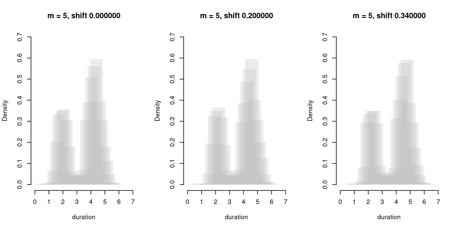
Figure 6: Shifted Histogram Overplots with \(h = 0.9\), \(m = 5\).
As we can see, although we still get some variability, the main features of the density remain largely unchanged. SHOs are therefore more resilient to changing data/bin alignment than plain histograms.
The issue with SHOs is that they are essentially a visual tool. While we could take the maximum of all shifted histograms and let this be our estimate for \(f\), this would fail to take into account that some regions of the SHO are less transparent (and thus, more likely to be part of the actual density) than others.
The final step in our histogram ladder, then, is a technique which takes these factors into account while constructing a numeric density estimate for \(f\).
Average Shifted Histograms
An Average Shifted Histogram [1] (ASH) constructs a density estimate by averaging together estimates produced by a set of shifted histograms just like the ones we had built for our SHOs. Formally, if we name the estimates produced by the \(m\) shifted histograms at \(x\) as \(f_0(x), \cdots, f_{m - 1}(x)\), the ASH estimate \(\widehat{f_{ash}}(x)\) for \(x\) can be written as:
\[ \widehat{f_{ash}}(x) = \frac{1}{m}\sum_{j = 0}^{m - 1} \hat{f_j}(x) \]
Or, in R:
# Average Shifted Histogram
ash <- function(X, nbins, m) {
  width <- diff(range(X)) / nbins
  f_ash <- rep(0, length(X))

  for (shift in 1:m) {
    f_ash <- f_ash +
      f_j(
        X = X,
        breaks = shift * (width / m) + seq(
          from = min(X) - width, to = max(X) + 1, by = width
        )
      )
  }

  i <- order(X)
  ash <- tibble(f = f_ash[i]/m, x = X[i])
  class(ash) <- c('ash', class(ash))
  ash
}

# Histogram Density Estimate
f_j <- function(X, breaks) {
  n <- length(X)
  f_dens <- rep(NA, n)
  for (i in 1:(length(breaks) - 1)) {
    low <- breaks[i]
    high <- breaks[i + 1]
    elements <- (X >= low) & (X < high)
    f_dens[elements] <- sum(elements) / ((high - low) * n)
  }
  stopifnot(all(!is.na(f_dens)))
  f_dens
}

# Plot ASH
plot.ash <- function(ash) {
  ggplot(ash) +
    geom_line(aes(x = x, y = f)) +
    ylab('density')
}
Let’s see how the plot looks for our Old Faithful’s data:
plot(ash(geyser$duration, m = 5, nbins = 10)) +
  xlab('duration') +
  ggtitle('Duration of Old Faithful\'s Eruptions (ASH, m = 5, 10 bins)')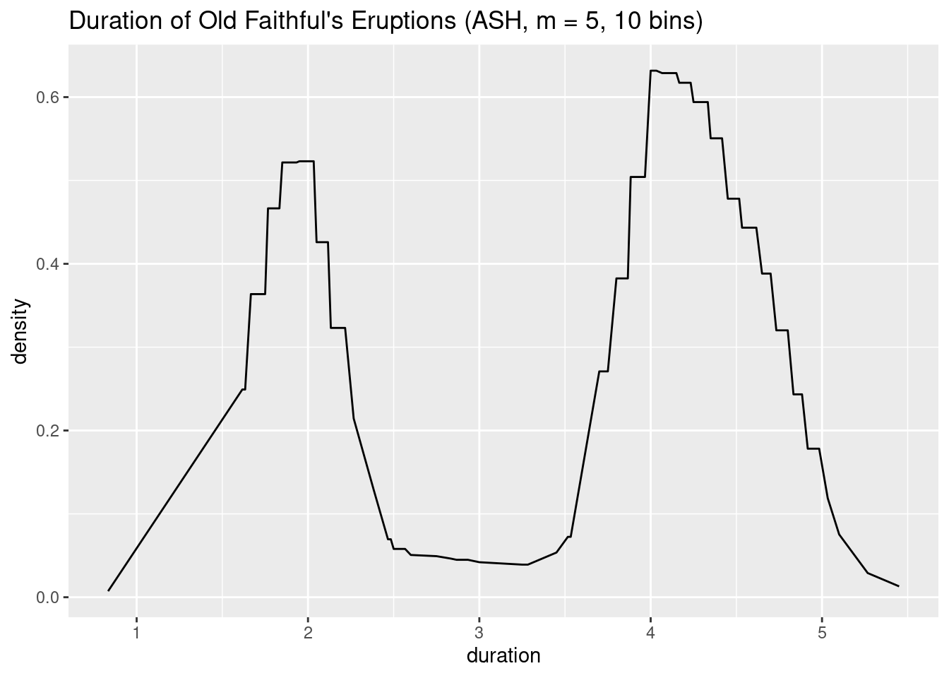
As we can see, the result is a much smoother function, with features that resemble the ones we could see in the SHOs of Fig. 6.
Connection to Kernel Methods
ASHes have some nice properties which they share with kernel methods. Scott [1] describes them as a middle ground between a kernel estimator in terms of statistical efficiency (which I presume to mean that their variance decreases faster with an equivalent number of samples than that of a histogram of equivalent bias) and yet are much cheaper to compute due to their relative simplicity.
While discussing matters of statistical efficiency is beyond the scope of this post (though I am certain to revisit it in later posts), it is nevertheless interesting to discuss the shape of the weight function and its relationship to the triangle kernel.
We start by dividing each of our intervals \(A_k\) (our bins of length \(h\)) into \(m\) subparts, as depicted in Fig. 7. Each subpart is actually a smaller bin, which we refer to as \(B_i\). For ease of notation, we assume that \(x\) is contained in small bin \(B_0\), and give negative indices to the small bins to the left of \(x\). Finally, let \(v_i\) be the number of points in our sample that fall in small bin \(B_i\) (\(\sum v_i = \sum n_i = n\)).
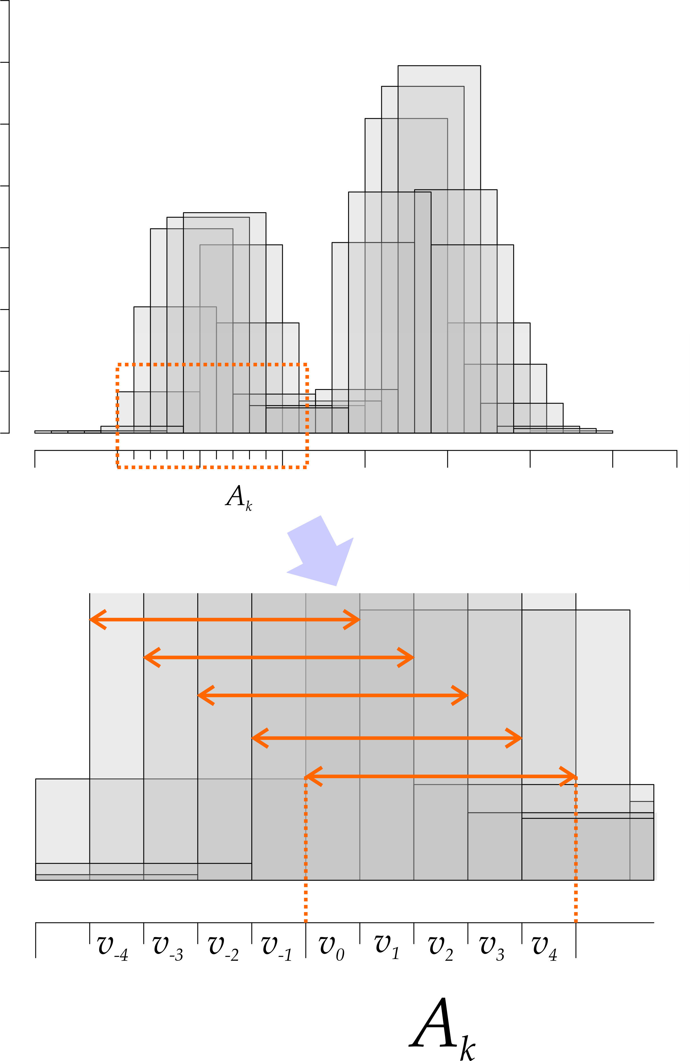
Figure 7: Shifted histograms and their partial estimates.
We know that the density estimate at \(x\) is the average density coming from \(m\) overlapping histograms. Looking at Fig. 7, we see that we can express those in terms of the \(v_i\) as follows:
\[ \begin{align} \hat{f_0}(x) =& \frac{1}{nh}(v_0 + \cdots + v_{m - 1})\\ \hat{f_1}(x) =& \frac{1}{nh}\left(v_{-1} + v_0 + \cdots v_{m - 2}\right) \\ \hat{f_2}(x) =& \frac{1}{nh}\left(v_{-2} + v_{-1} + v_0 + \cdots v_{m - 3}\right) \\ \cdots&\\ \hat{f_i}(x) =& \frac{1}{nh}\left(\sum_{j=1}^{i} v_{-j} + v_0 + \sum_{k = 1}^{m - i + 1}v_{k}\right)\\ \cdots&\\ \hat{f}_{m - 1}(x) =& \frac{1}{nh}\left(\sum_{j=1}^{m - 1} v_{-j} + 0\right) \end{align} \]
We have, therefore that:
\[ \begin{equation} \frac{1}{m}\sum_{j=0}^{m-1}\hat{f_j}(x) = \frac{1}{m}\frac{1}{nh}\left[mv_0 + (m - 1)(v_{-1} + v_1) + \cdots 1(v_{m - 1} + v_{-(m - 1)})\right] = \\ = \frac{1}{m}\sum_{j = 0}^{m-1} \frac{(m - j)}{nh}(v_j + v_{-j}) \tag{6} \end{equation} \]
We can see Eq. (6) as a weighted sum, where the underlying weight function assigns weights \(\frac{m - j}{nh}\) to both \(v_j\) and \(v_{-j}\). If we plot these weights as a function of \(v_i\), we can observe the shape of the weight function. We plot those in Fig. 8 for \(m \in \{5, 15, 100\}\). As we increase \(m\), the weight function approaches a continuous triangle and the behavior of ASHes approaches that of kernel density estimation with a triangular kernel.
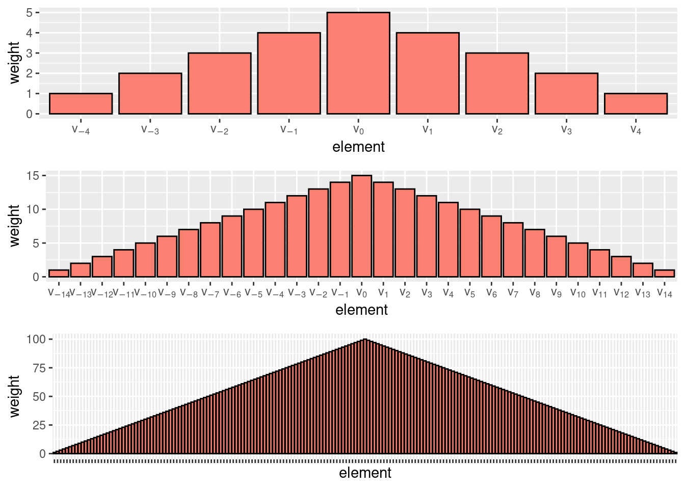
Figure 8: The ASH weight function tends to the triangle kernel as \(m \to +\infty\).
Summary
Histograms are an intuitive and widely used tool for density estimation. In this post, we have presented a slightly more formal treatment of histograms and their relationship with the underlying density, formalizing some intuitive notions, such as the fact that histograms are inherently biased estimators (it is difficult to represent a smooth function with rectangles) and that reducing this bias by adopting narrower bins entails a cost in terms of increased variance.
We have then discussed a different type of variance that arises in histograms as we change the alignment of bins and data. We have seen that Shifted Histogram Overplots can successfully mitigate this type of variance, and used them as a building block to explain Average Shifted Histograms. Finally, we have discussed the relationship between Average Shifted Histograms and the triangle kernel.
[1] D. Scott, Multivariate density estimation. Wiley, 1992.
It is actually a bit more complicated than that: the equation says that the slope of whatever remains outside of the rectangle after we matched the areas will bound the bias, and you could have a very tall function which still looks like a rectangle. The intuition that “flatter” functions will have smaller biases is still nevertheless correct.↩︎
While you could clearly just center the data, this is more of an issue when your data is already “cut” at a shifted location but you cannot know what the shift is, as in with an image, or with a time series. Further, the techniques developed here will pave the way for discussing kernel density estimation later on.↩︎